DABBLE WEB APPLICATION
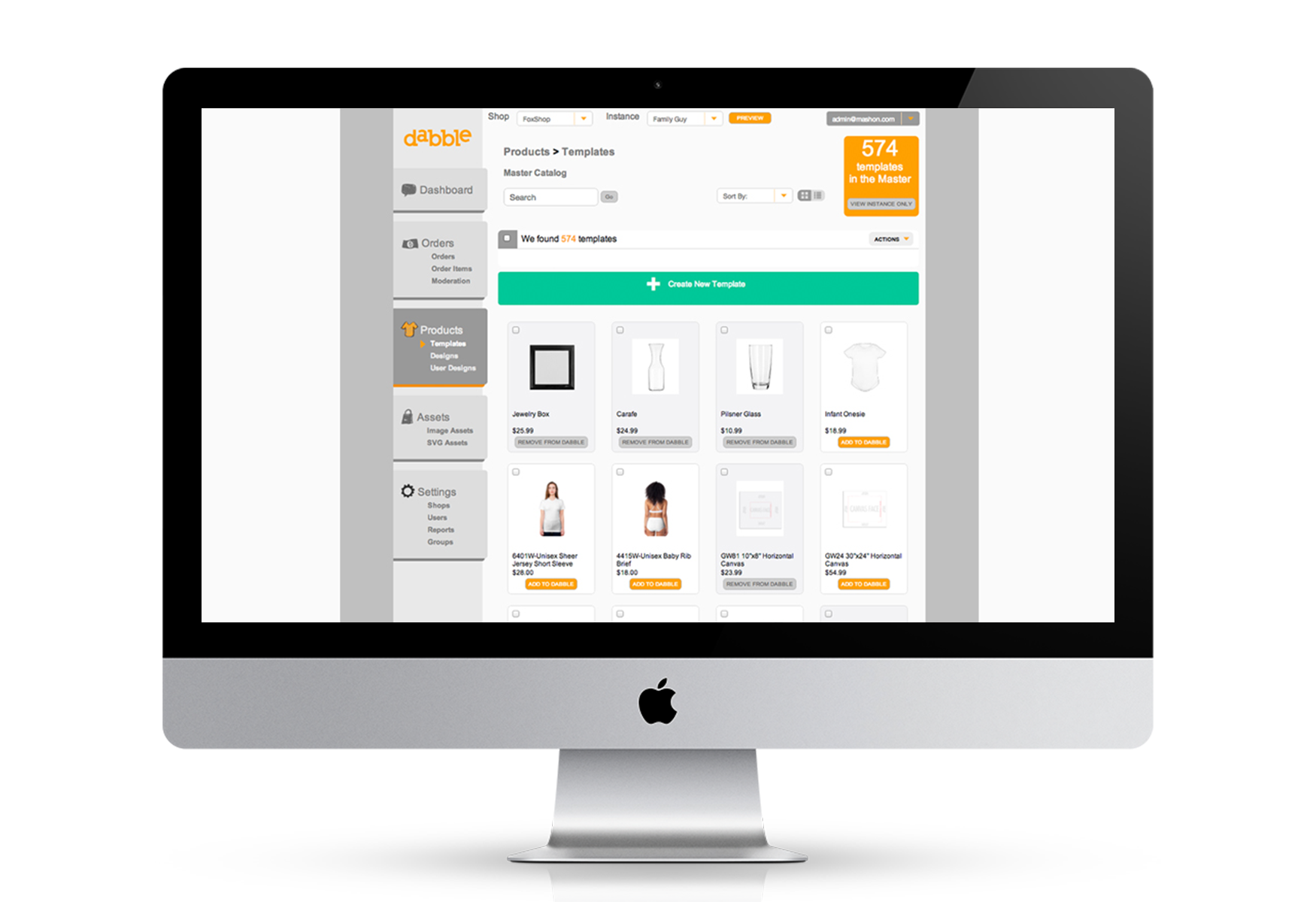
Dabble is an HTML5 product customization application which can be embedded on any web page or store. The software allows consumers to customize or personalize a product using branded assets or user uploaded assets within the constraints set by the store owner. The Dabble Administration suite provides store owners the ability to select which products they wish to sell, set their pricing, manage their orders, their assets and so on.
Dabble Admin was initially designed and developed within a very tight timeline and two years after it’s creation, the team decided to do a refresh based on the feedback we had been receiving from clients and our own users. The updates would be rolled out in phases rather than one giant update that could potentially shock users.
ROLE: UX/UI DESIGNER
TOOLS: PHOTOSHOP, OMNIGRAFFLE
YEAR: 2013
Dabble’s old site navigation
RESEARCH
The first part of redefining the Dabble Admin experience was conducting user interviews with a variety of stakeholders and users and then reviewing the feedback it gave us. We decided a refresh to the navigation should be our first part of updating the admin. It would enable us to update the user experience while not creating drastic changes to the layouts of every page, which would require more testing and design.
Dabble had a left navigation that was taking up a lot of real estate. We did a competitive analysis and looked at other admin dashboards and how they treated their navigation and realized a top navigation would serve our purpose better.
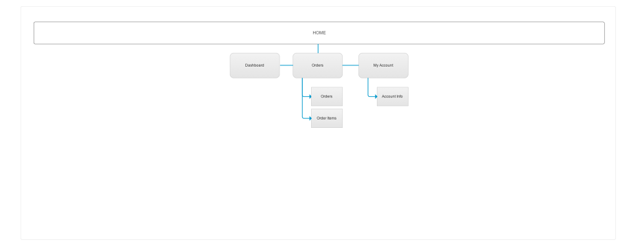
USERFLOW
Dabble Admin’s dashboard has various users with different permissions we needed to account for the new navigation.
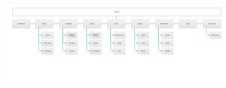
WIREFRAMES
We experimented with different layouts in our wireframe stage and whether or not to implement icons with text. We agreed that the main sections of the admin should be visible with text, while the lesser parts would be represented as icons. Once that was narrowed down we moved onto drop-down menu and sub menu explorations.


VISUAL DESIGNS
The old admin had very light pastel colors with fonts that were a little illegible, so we made the overall look darker and bolder. We also used MashON’s color scheme of orange and grey to unify the Dabble application with the company. Once the look was finalized, we created the documentation to be handed over to the development team.

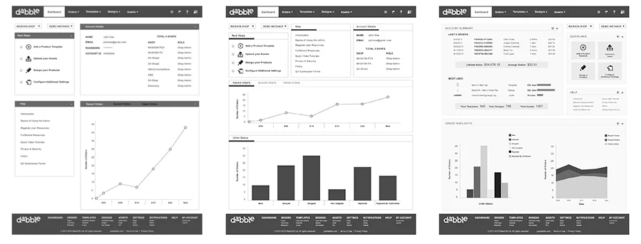
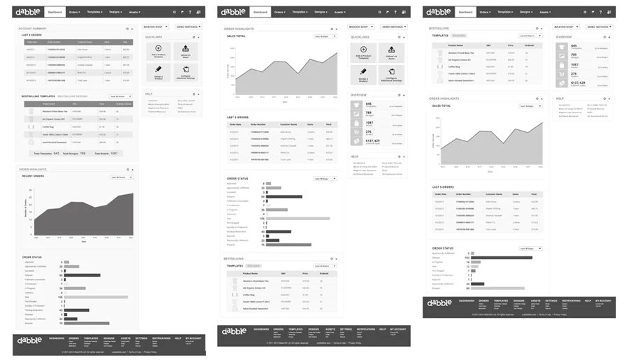
DASHBOARD UPDATE
We interviewed not only our users and clients but internally as well so that we could get an overall idea of what each department did and wished to see while on the dashboard. We did a competitive analysis of other administrative dashboards and focused in on the ones who were involved in e-commerce.